By Gemma Bonfiglioli, news correspondent
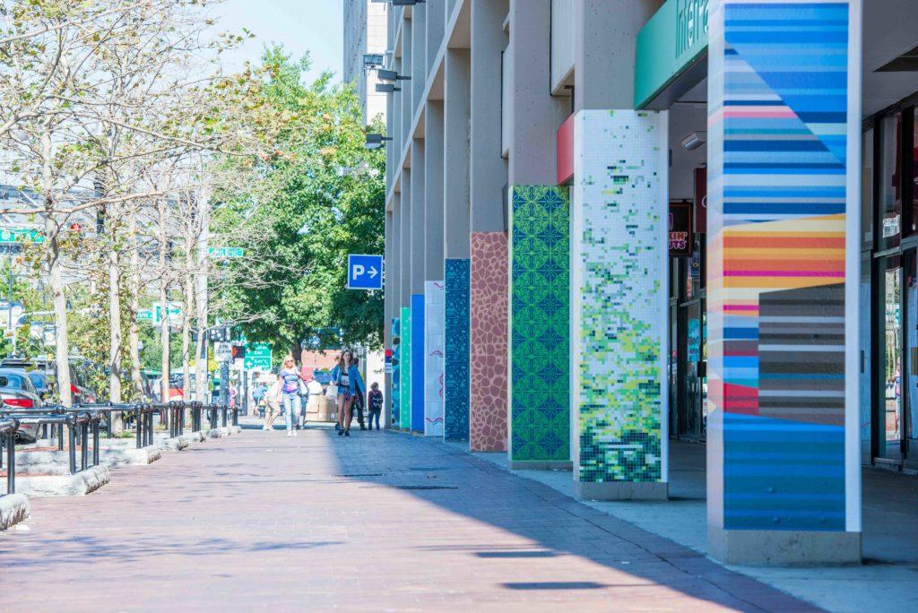
In the latest splash of color to hit the Rose Kennedy Greenway, nine formerly-gray pillars along a pedestrian walkway have been painted over with abstract patterns designed by local artists.
Pattern Walk, the public art installation, wraps around the columns of the Harbor Garage structure, located at 70 East India Row, near the Harborwalk and the New England Aquarium. Design Museum Boston collaborated with the Chiofaro Company, the Harbor Garage and Boston-area graphics firms to put on the project.
“The [exhibit] is a unique way of presenting an art form that is usually only portrayed digitally,” Cei Lambert, a 27-year-old designer with web design company Fresh Tilled Soil who created the pattern “Luna Moths” for the exhibit, said.
“Luna Moths” features a repeating yellow pattern set against a navy background. Viewers who stand close enough realize the pattern is composed not by lines but by four moths, explained Lambert.
In addition to Fresh Tilled Soil, eight other local design firms and artists developed patterns for the exhibit: The Analogue Studios, DockYard, Proper Villains Agency, The Design Group at Arnold, Image Conscious Studios, Artaic, Kim Poliquin and Cast Collective.
Each pattern centers around a unique theme and includes elements of cubism, the abstract, digital design and optical illusion. These features combine to draw in pedestrians from afar and engage them as viewers while they approach, according to DockYard designer Tim Walsh and creative director Steven Trevathan, who together crafted “Shapes #2.”
“When you’re very far away from our art, it appears to be a different pattern to when you approach it,” Trevathan said. “We knew that it would be outside and people would be interacting with it at different view lengths.”
Trevathan and Walsh said they outlined 50 different patterns before coming up with their final result, one that emphasized high contrast – the artists’ focus – in addition to color, which they say Design Museum Boston requested.
“I think it kind of morphed over the creation of it,” Walsh said. “With each layout I was trying I was figuring out different meanings in each one.”
The final version of “Shapes #2” portrays a collection of green geometric solids and prisms, outlined in black and set against a flat green background.
Like Walsh and Trevathan’s pattern, the Greenway has undergone a series of transformations in recent years, according to local designer Megan Ducharme. Ducharme’s piece “Cow Tongue” aims to reflect that theme, she said.
“The concept was transition because the Greenway had gone into transition recently,” Ducharme said. “Cow Tongue” features a series of concentric black lines set against a white background with three wavy ribbons of pink superimposed on the measured, black-and-white geometry.
Inside the nearby Design Museum Boston store, Stephanie Andrews, an intern, greeted people as they entered the center to view the wide variety of artistic products made by local designers.
“Sustainability is really big in design right now,” Andrews said. “The Museum is trying to source from Boston artists.”
Andrews said that since the patterns had been installed, she had noticed people outside observing them, though not as many people had been reading the descriptions of each pattern as she had hoped.
Several of the artists involved expressed excitement that Boston residents and officials alike were embracing public art.
“I think [Pattern Walk] shows promise to the area that Boston is willing to accept and exhibit the creative nature of the city,” Walsh said.
Lambert went further with his praise for the city and the exhibit.
“[Pattern Walk] is doing an amazing thing,” Lambert said. “It shows different applications of patterns and different ways of having the pattern seen.”
The exhibit will remain on display until Nov. 4.
Photo by Scotty Schenck. Visit our gallery to see more photos of the exhibit.


