Ask The News: Why is the New England Aquarium designed like that?
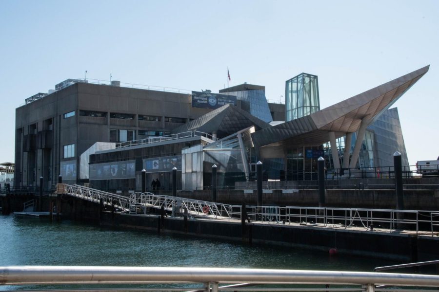
The exterior of the New England Aquarium sits on the Boston Harbor. Opened in 1969, many visitors have criticized the building’s appearance.
April 3, 2023
This article was produced as part of an initiative we’re calling Ask The News, in which the Northeastern community can submit questions to us and, if it seems like we can put together a story based on it, we look into the answers. This article was written in response to the question: “Why is the aquarium such an ugly building? Why was it designed like that?”
To its architects, the New England Aquarium’s exterior houses an immersive sea-creature-filled experience. But to everyone else, it might just be ugly.
The aquarium, initially a beige, concrete central building, opened its doors to visitors in 1969. Since then, the stainless steel angular extensions and glass windows have worked to enhance the aquarium’s exterior. But as designer Peter Chermayeff explained, the aquarium’s design prioritized the interior function over the aesthetic of the exterior.
“Some like it, some don’t, some find it brutal,” Chermayeff said. “The use of concrete everywhere is not everyone’s favorite material … for me that’s secondary because the purpose of the building was to become a framework for having an experience of life underwater.”
Chermayeff explained when the aquarium was designed 55 years ago, architects and designers did not have the funding or resources they do today. The design team had a limited budget and popular modern techniques like acrylic panels did not exist in the 1960s. So, the architects’ focus went toward designing the interior.

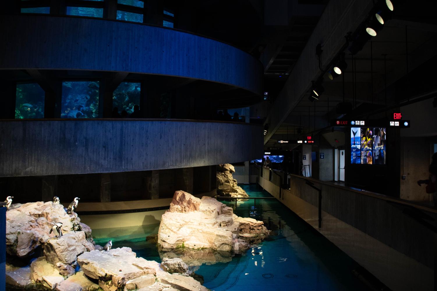
With a variety of attractions for visitors to experience, from the Giant Ocean Tank, to a Penguin Exhibit and an interactive touch tank, Chermayeff and his team prioritized the functionality of the aquarium and its exhibits over its looks. One of the aquarium’s main attractions is the Giant Ocean Tank, a four-story circular saltwater tank home to reef animals like sea turtles, eels and fish. Using custom luminaires and LED-lighting, designers from the company Lumenpulse sought to focus visitors’ attention on the tank.
“The design concept for the Giant Ocean Tank was to add a sense of theatricality by highlighting the animals and coral reef with dynamic, enhanced naturalistic lighting,” wrote Matt Zelkowitz, a stage designer that worked on the tank, in a Lumenpulse publication.
Another notable exhibit is the New Balance Foundation Marine Mammal Center, an open-air exhibit where aquarium visitors can watch mammal trainers interact with the aquarium’s northern fur seals and California sea lions. In the wild, these animals spend time both on land and in water, so the exhibit features a large swimming area and deck space to replicate their natural environment.
While the aquarium’s exterior bears the brunt of frequent criticism, some visitors find problems once inside as well. David Huang, an architect and designer at Payette, wrote an architectural forum titled “Are architects out of touch?”

Huang asked respondents what buildings in Boston they disliked, and one response mentioned the New England Aquarium: “It is true that fish [need] dark spaces, but there could be more areas with natural light.”
A handful of Boston residents and visitors share the opinion that the aquarium is dark, dreary and even ugly. In fact, a quick visit to Tripadvisor reveals similar descriptions of the aquarium as “dark and depressing,” and an “old, tired, ugly, cramped, sad aquarium.”
Outside of what some visitors may consider a poor design, many have written about good experiences at the aquarium. One aquarium-goer said the building had “great live displays of ocean life,” and another reviewer said, “The multitude and variety of fish and other creatives in beautifully designed habitats is well worth the price.”
While the New England Aquarium may not be the most beautiful to look at from the outside, the inside-attractions and educational experiences are what received the majority of focus when being built.


