Data expert warns of fake visuals
December 6, 2017
As the data visualization community pushes forward with new technologies, it is leaving a part of the general public behind, a prominent data journalist and visualization expert told the Northeastern community Thursday.
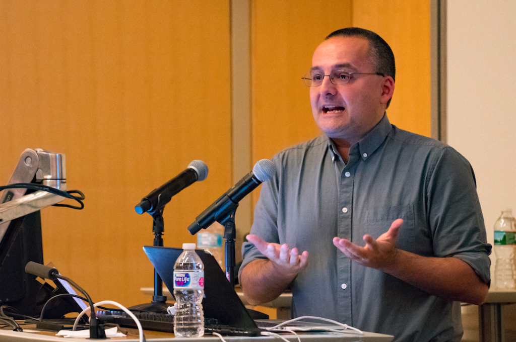
At the “Visual Trumpery” talk in West Village F, Alberto Cairo, who authored data visualization textbooks used in many Northeastern courses, said the purpose of his year-long talk tour is to help people become better readers of data visualization.
“Visualizations are everywhere right now, so we need to learn how to read them,” Cairo said. “Visualizations are never intuitive, visualizations have a grammar, visualizations have a vocabulary, visualizations have a symbolization system, and people need to learn how to read them correctly.”
Cairo named his talk series after the Middle English word “trumpery,” which he explained means something that deceives the eye. He came up with the idea for the name after the 2016 election when someone he followed on Twitter tweeted the word’s definition.
“First of all, it will help me attract more people because people will feel provoked by the title; they will come to the talk, expecting to hear something that the talk is not about,” Cairo said. “It would also help me make the first point as to how we can become better readers of visualizations. We must always read beyond the title because if you do not read beyond the title you will be misled.”
Cairo outlined five principles for readers to follow when reading data visualizations: Readers should check the data’s source, avoid adding extra meaning to graphs, ensure data is represented accurately, make sure enough data is presented and question whether or not the graphic considers uncertainty.
He said the second of these points is a bit obscure. When people look at visualizations, they tend to read too much into them. These connections happen just in the mind, not within the graphic.
“We tend to infer too much on the data that is presented,” he said. “Sometimes we do this for political reasons. We are very ideological. Whenever we see a graphic that confirms what we already believe, we tend to use it as an argument to defend our own positions.”
As an example, he showed a graph that liberal-leaning people shared on Twitter to defend the idea that the Affordable Care Act, or Obamacare, was great for the job market. The graph embedded the date the act was passed on a timeline showing the number of people employed in the United States from 2007 to 2017. Cairo said this graph could not be used to say Obamacare is good for the economy.
“The graphic is just showing two unconnected phenomena,” he said. “On one hand, it is showing you employment: The number of the people in the job market going up and going down. And on the other hand, it is showing you the moment at which one particular law was passed, Obamacare was passed … It could be that they are connected but we don’t know. The chart alone is not enough to make that connection.”
Irene de la Torre, a 2016 alumna of Northeastern’s CAMD graduate school who studied information design and visualization, said Cairo was very familiar to her and all of her classmates. She said the event was powerful because it showed her how visualizations can be impacted by the creator’s biases.
“Right now I’m doing visualizations but I’m also a journalist,” said Torre, who currently works in the MIT Senseable City Lab. “The first time that I worked doing infographics for a newspaper I thought that they were the truth and then you start realizing that you can kind of guide the opinion of the reader.”
Simon Gusev, a second-year journalism major at Emerson College, attended the event on a recommendation from his digital journalism professor. He said he may use information from the talk to incorporate data more in his reporting.
“I just learned some important facts about data in that sometimes people just speculate about it,” he said, “and as a journalists we need to be concrete and true to ourselves to make something that’s going to be beneficial for people, not only for us.”
Cairo followed his initial discussion with a conversation on the ethical standards individuals should use when creating or sharing data visualizations. He said it is important that people become aware of their own biases, remind themselves it is more important to be truthful than to win an argument and ensure graphics are legitimate before sharing them.
Conceptual tools like data visualizations, Cairo explained, can be compared to physical tools, such as a hammer.
“Visualization extends our perception and extends our cognition,” Cairo said. “A hammer extends our own arm and makes us stronger when we need to build something.”
Both tools, he said, can be used to build — just like a hammer can be used to build a house, a data visualization can be used to build understanding.
“But exactly the same tool that you know how to use really well, either a hammer or a visualization, can also be used to destroy,” he continued. “To destroy houses with a hammer, or to destroy understanding with unreliable or badly designed visualization. And it is our responsibility to choose how we read, how we use and how we spread data visualization.”


